Inflorescence
18/11/2025
Inflorescence
A Conversation Piece with Katherine Jones RA
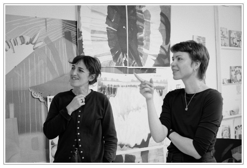
A Conversation Piece with Katherine Jones RA
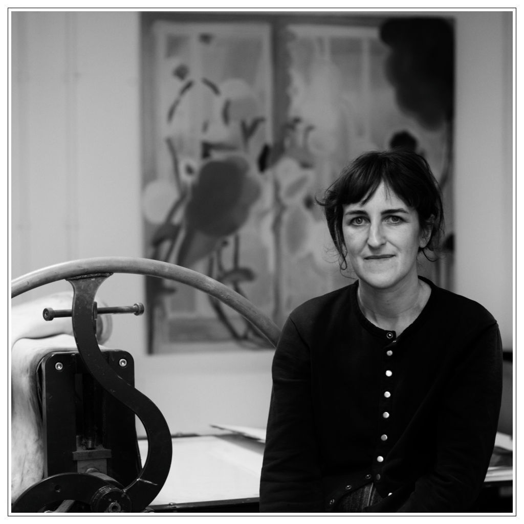
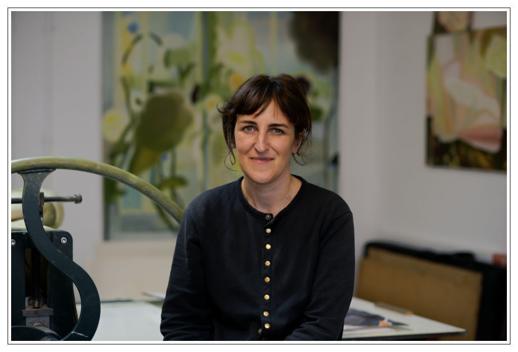
Katherine Jones RA
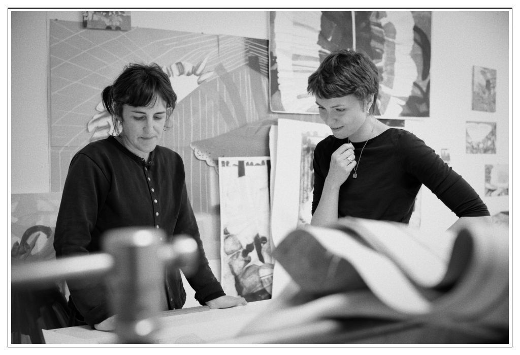
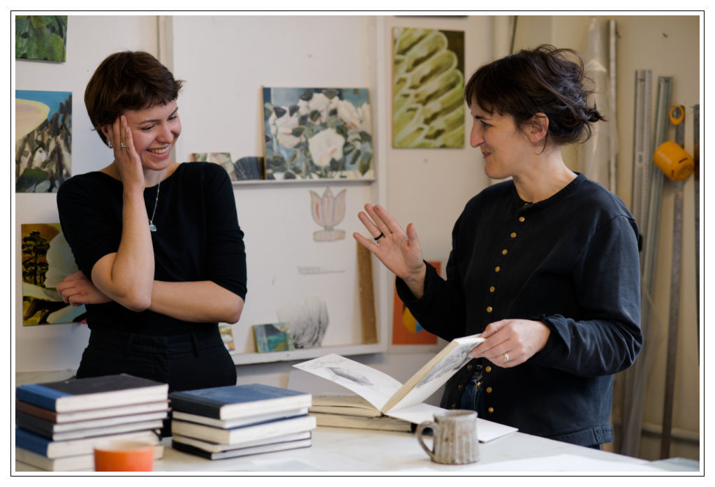
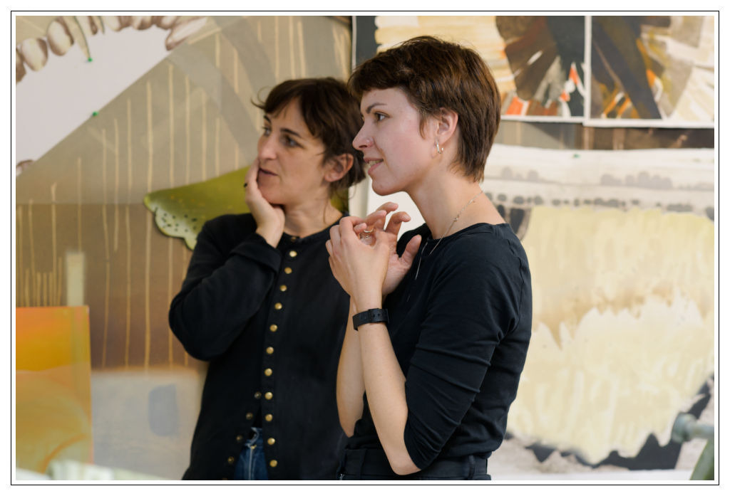
I first encountered Katherine Jones’s work in her show ‘Fine Ladies and Gentle Men’ in the Gainsborough’s House Museum this summer. What struck me was the simplicity of the colour; a tall portrait-oriented painting of abstracted organic shapes; what seemed like an oversized petal dressed in a swathe of pale not-so-colour, one that invited closer investigation; contemplation. I had a sense that there is a genuine exploration happening; from one piece to another the paintings seem to be an extension of one thought process; and yet each stands on its own as a finite and fully expressed thought. I was intrigued - and excited when Katherine agreed to meet us for a Conversation Piece.
The sense one has when coming into Katherine’s studio - and indeed from her work too - is of an overall consistency. Colours and themes are like threads woven into a tapestry of her work. Shapes of flowers and abstracted organic forms as actors returning to stage with each and every painting, and as such create a story that is told in time. Colours appear and animate a painting that I thought I had already seen and understood; but it is only after seeing it for the third time and from a different angle or place in the room that I notice three spots of blue; quite bright closer to a cobalt; so different from the rest of the painting’s tone I am surprised I haven’t spotted them before. Like a song that is transported into a different key - they make the canvas sing with new life; illuminating the other tones, that are in between, hovering between shades. The new addition - new from my perspective - makes the colours shine differently. Like a window pane when sunshine comes through it; colours that were already there become brighter; and new ones appear.
Throughout our time talking and looking at her prints and paintings, there is a sense of genuine exploration; of discovery. As if the idea of returning to what is essential, to a renewed new beginning was an expected part of the process. And yet this process allows for depth and maintenance of what is true and core in Katherine’s work. The return doesn’t dilute or discard what is already there; but rather brings more meaning and depth every time a topic, a similar entity; or a colour reappears.
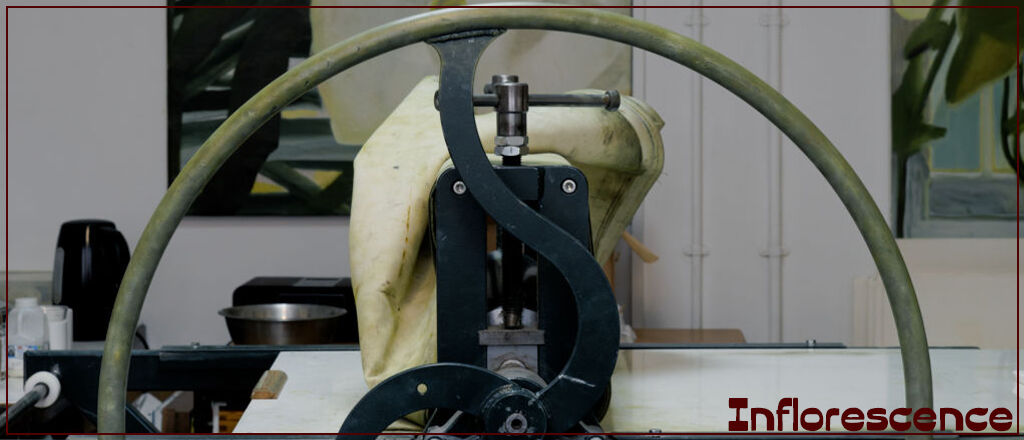
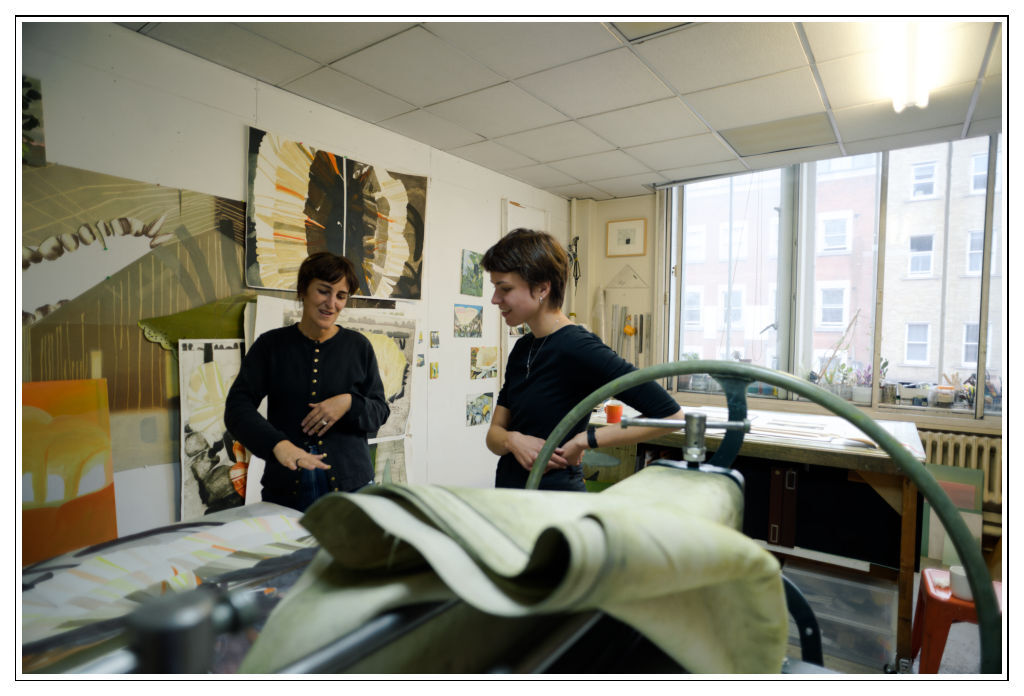
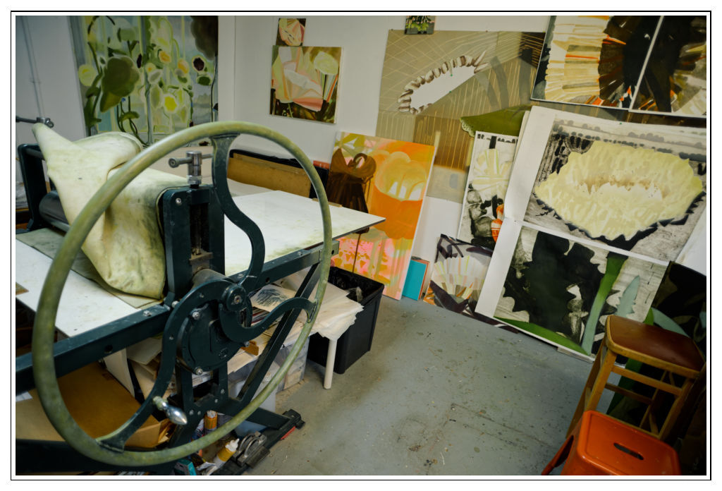
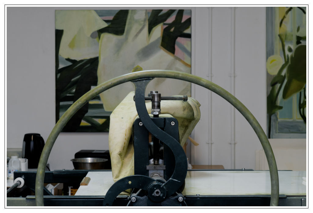
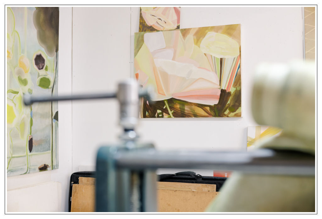
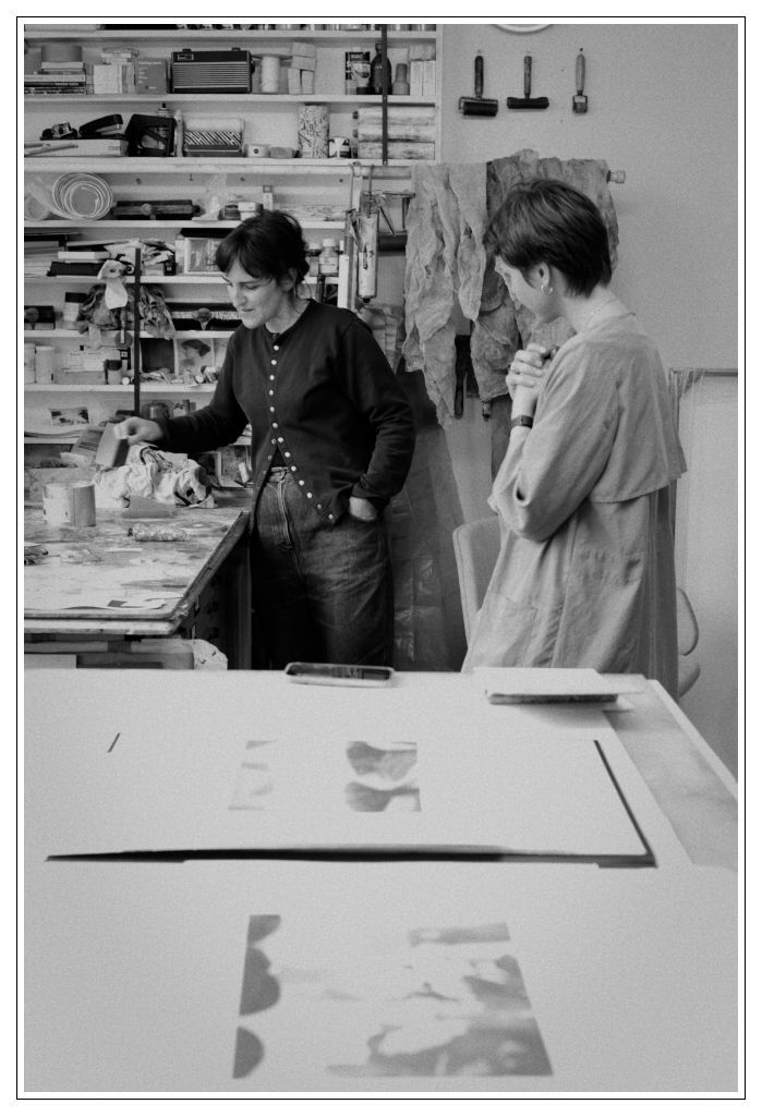
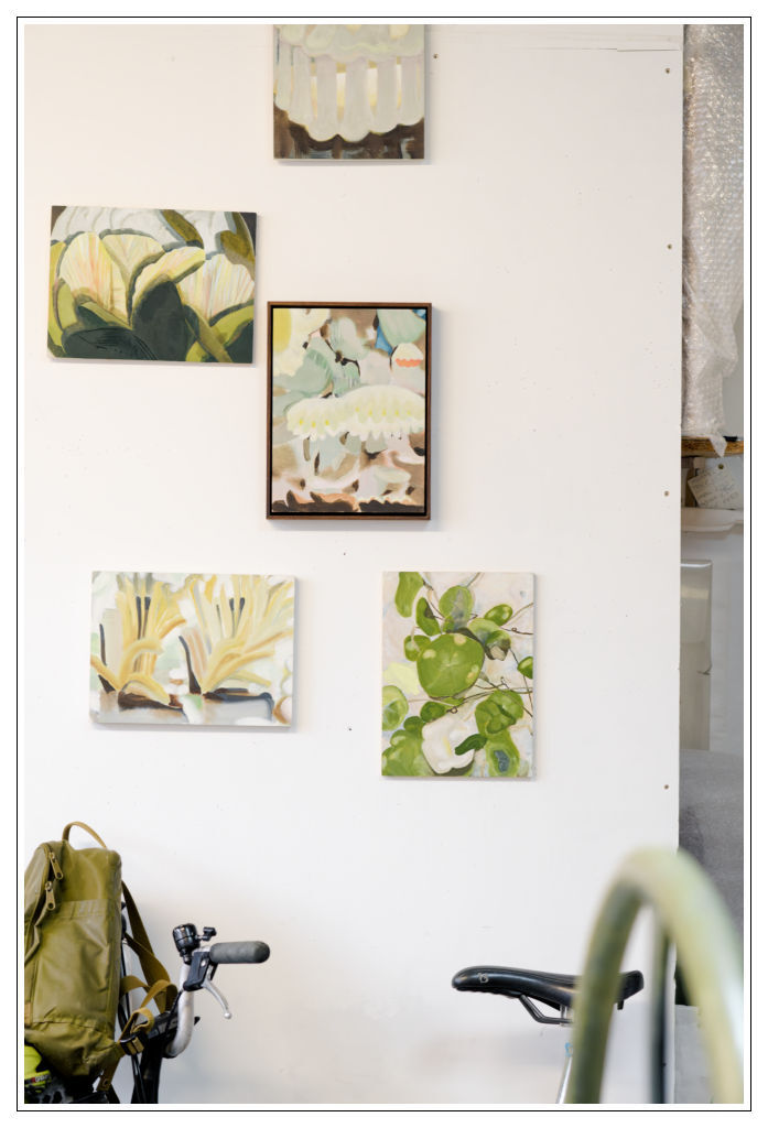
Katherine’s old studio in Brixton, which we had the honour of visiting just weeks before a move to a new space, was true to her practice. The medium sized room; a surprising oasis just one level above the busy Brixton main street was flooded in a dilute soft light, glass panels extrapolating the colours of the sunshine that has passed through the overcast sky. Everything seemed to have been tinted with that pale grey colour of the clouds and what stood out were pots of colour around us; the first was the turning wheel of a forest green printmaking press. It turned into the light-mint soft green that seemed to emanate from many of Katherine’s canvases and prints hanging on the walls. A perfect efficiency and orderliness reigning in an obviously creative process; that kind of practicality that is required of the artists whose chosen medium is printmaking; steps and the push and pull of processes and materials intercepted by bursts of pure and free creativity.
The paintings are multi-layered; enigmatic yet clearly with a purpose, they thread finely the balance between being ornamental and beautifully decorative and at the same time true to something we strive to understand and recognise.
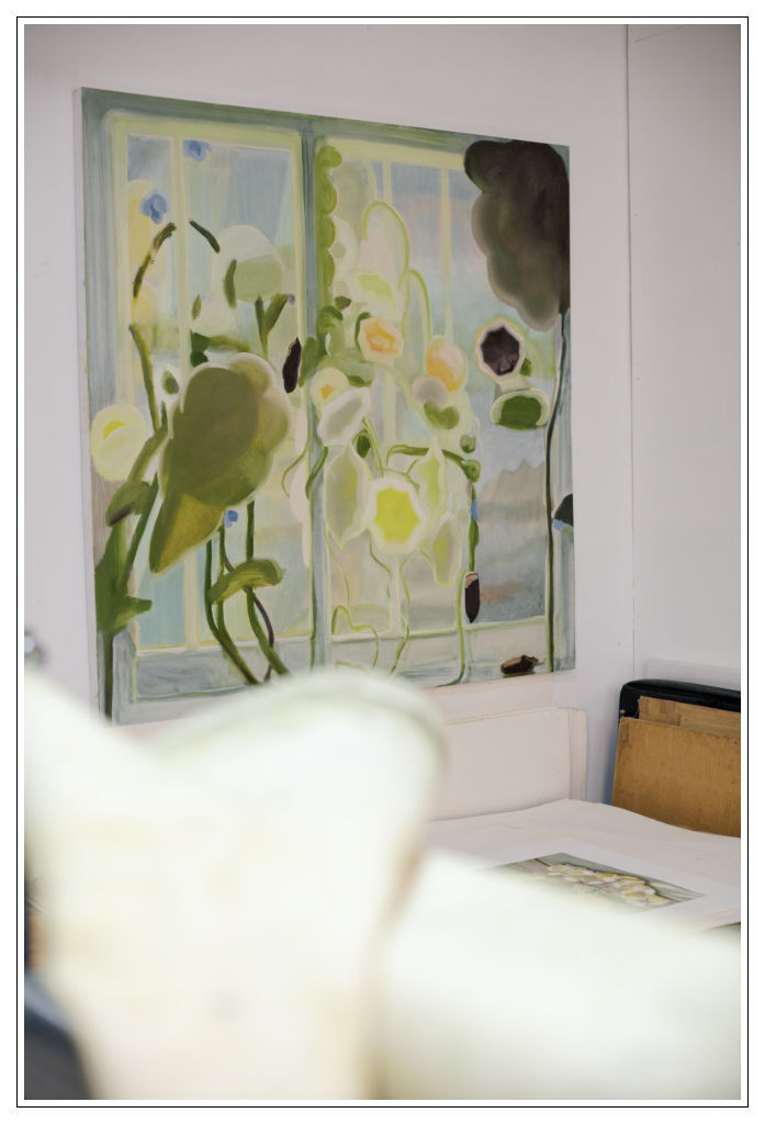
Flowers as stand ins for characters; they appear among greenery in small, intimate spaces; a scale of which remains unknown to us. I mention the still-life of Winnifred Nicholson, “Where you get that sense, maybe there is a window and then there is a landscape, but when you look at the flowers, there’s not much space other than sort of abstracting it into an architectural form or this other spatial relationship.”
“I agree with you about that perspective because there are indications like outside of the window, there’s a lighthouse and then, the narcissus are standing on the window sill and all of that.. But they are all kind of indications rather than paintings of these things, aren’t they? They are not clear.. there is no lines or perspective going at all. I really like that; my Mum was a big fan of her so we probably had these around..”
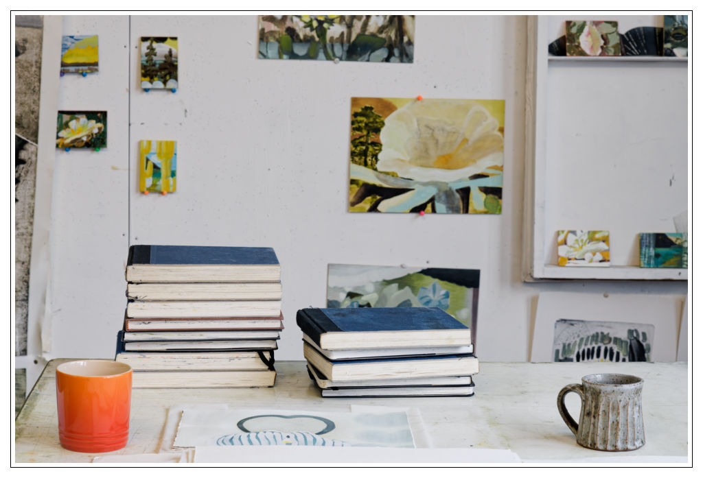
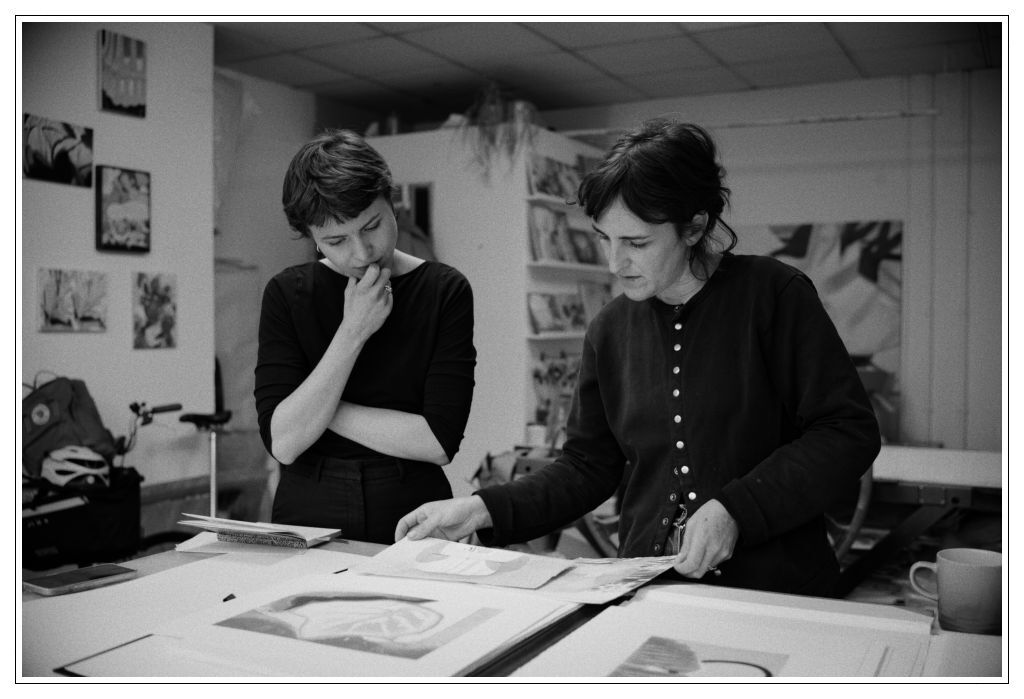
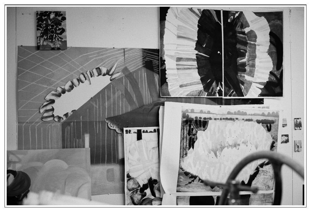
Katherine shows me small, around b5 sized watercolours that are painted on what would otherwise be waste; offcuts from her stock of printmaking paper. She says it gives her a certain freedom; “No one is going to see them, it’s very freeing…” Next to them are prints that were inspired by the watercolours; one in particular stands out to me; a large white petal covers most of the surface; and almost identical to the watercolour in the print is the petal’s translucency and how it covers the layers underneath; suspending them in mid-air, in mid-time; looking through them is like looking at something unfolding, having the privilege of observing something in process; captured by the medium of print; or watercolour, and how effortlessly the same quality is translated in the resulting print.
In some of the paintings the colour explodes amongst the greenish background and seem to extrapolate and separate into its own each individual shape, a stripe; an individual flower petal, yet altogether they come together and create a uniform sense of lightness; of sunshine; like reflections of rainbow moving gently yet assuredly across the wall of the room. I am struck more than once with the idea of how lovely it would feel to come into a room in a house and see one of her paintings there; like a touch of sunshine whenever you walk in.
There is a simplicity; a child-like wonder and innocence in looking and appreciating things that are simple but charming - like pansies. “Part of me was allowing myself to go back and look at pansies and really enjoy them. You know, it’s a flower that little kids would appreciate..”
Greens and purples interlaced, petals of flowers that are both recognisable and alien. An ornament, an open mouth; petals of a flower whose centre is a path to a different world; a luminescent rainbow spilling out and over the rest of the world; the rest of the painting. A layer of purple smudged into the brown-green merely suggested background. A portal to a different world; a portal to seeing the world differently perhaps too.
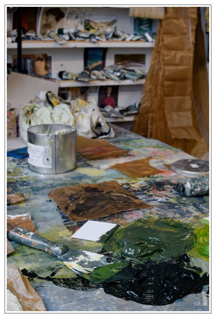
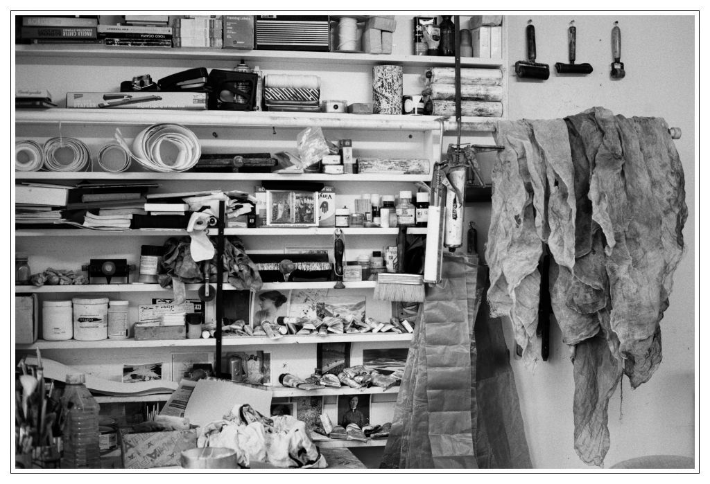
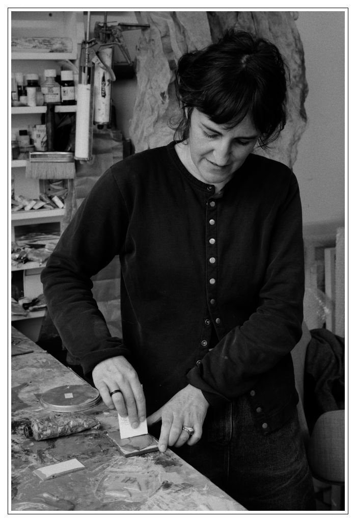
I ask Katherine whether she uses some more transparent pigments in her greens; as there is a very tactile quality to some of her brushmarks; especially in the paintings on board; where we can see the ridges made by the brush, and they read both as just that and the structure of the imagined leaf. Katherine takes me over to her colour mixing table, with pre-mixed colours painted on a glass; a subdued, restricted palette of balanced half-tones. I remember putty greys; a soft violet; a minty green; dark earthy brown-green, and maybe the effervescent yellow too.
Katherine opens a tin and says I use a lot of this translucent printing medium, you see, and there is this viscous milky-like substance sitting in the half bottom of the jar. I am immediately transported to my high school years; etching and linocutting and the subterranean printmaking studio in our college.
“The beginning of the painting process is the best, it feels the freest.” Katherine takes a square piece of cardboard, and says, “I just go with colour, quite freely, and put it like this”; smearing the pre-mixed colour on her glass palette, flatly, with her ready-made card-board squeegee. “It’s only afterwards when it gets complicated.” We laugh.
Coming to Katherine’s studio I have been thinking about ‘liminal’ colours; colours that would not perhaps have a name in our language, or maybe we wouldn’t set out to mix them in the first place, and yet they happen or appear in the process. Not secondary colours per-se, more like transitory colours.
“Well I think that you don’t really see the colours on their own, really, you look around and get an overall sense, a grey, dark green, and then spots of colour within that.”
Simplicity in the colour palette, the ease and wonder are not the only child-like qualities; there is a sense of hope too. The colours, as simple and curated may be, are also imbued with life; vibrating, charged to the fullest, in the same way a colour of an object appears brilliant when the sun comes out. Blue patches next to brightest little clouds electrified with yellows and pinks and greys; the whole painting sings without the need for a break; without the need for our eyes to have somewhere less meaningful to ‘rest’, somewhere to just fill in the space of the canvas. Drawn and painted with ease, they have this other intensity; one that is peaceful and warming and soothing in a way.
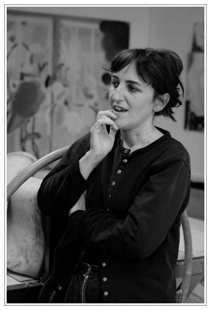
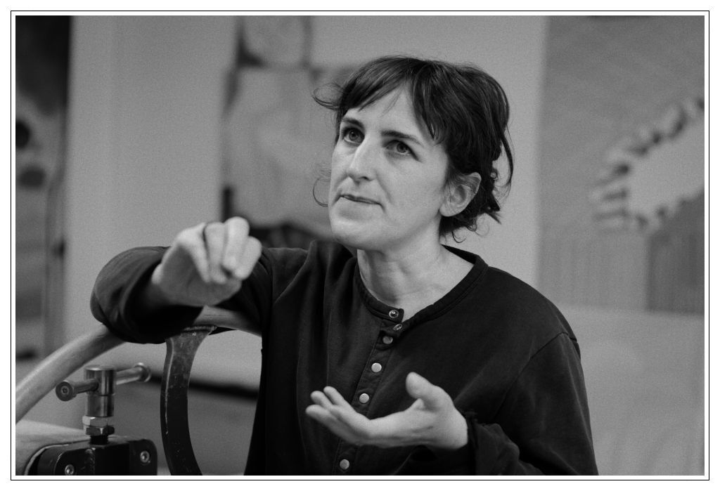
Katherine herself is warm and approachable, and puts one at ease with her openness and being so down to earth. Just like her paintings there is no unnecessary fluff or noise to distract from her message. Towards the end of our conversation I felt like we were old friends catching up; it was such a treat to go and speak to her about the work.
The motifs; flowers; are like dancers; in movement, a rainbow unfolding in space and time in a world that feels soft and calm. They seem feminine in that they are mystical and don’t seem to need a clear resolution. An inner curiosity, openness and a return to what is true to the artist is all that is needed for new discoveries to happen. Ones that feel new and deeply familiar at the same time. And I think that this is true to the way Katherine and her work is; evolving, growing, ever so subtly changing and reaching to new territories, yet remaining true to herself.
Text © Martina Šišková
Photographs © Jon C Archdeacon